
Infographics have become the darling of the social media world. You can’t spend more than five minutes on Pinterest without seeing an infographic being pinned to hundreds of boards per image. Blogs are able to vastly improve their traffic by providing graphics in lieu of traditional written blog posts. They are popular and reach viral status easier.
Not only that, but you can re-package other content to make infographics, and so spread your authority to a whole new audience. Not everyone learns or retains information the same way. Having a visual format ensures you connect with those who prefer to see the data, not read it.
Quick tip: When you publish your infographic on your site, make sure you encourage other people to re-publish it.
These are five easy-to-create infographics that you can apply to any niche. You can even make one of each using the same information, if you like!
Infographic Timelines
Sometimes what is most interesting about a topic is the way it has adapted and evolved since its inception. A timeline allows you to create a full collection of those changes through a complete timeline. Your viewers will be able to see how each new piece of the puzzle makes up the whole at the end, and how each step impacted the next.
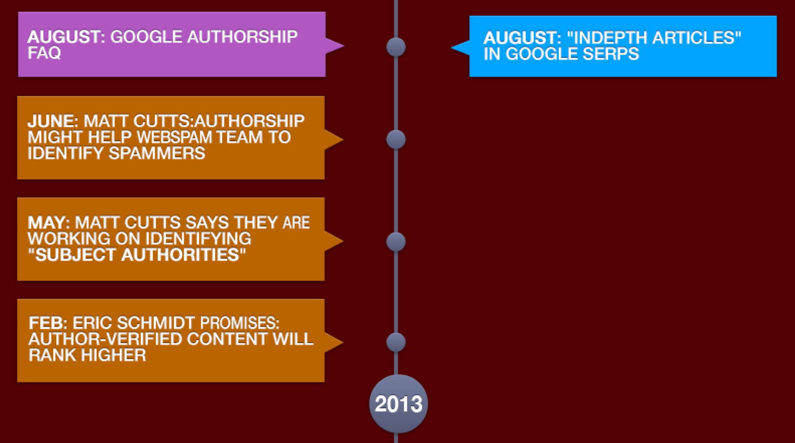
A great example of a visual timeline is this one on Hubspot. It shows a breakdown of all the algorithms Google has gone through, and when.
You also see these infographics used often by news or investigative sources, laying out a sequence of events such as a timeline from the lead up and follow up of a crime. It is a much more organized way to present a large number of events than just writing them out. Viewers will make sense of the timeline more quickly and easily that way.
Try this tool to create an infographic timeline: Canva
Visme infographic tool has cool templates for timelines, so you can actually create one for free, no design skills required!
Infographic Flowcharts
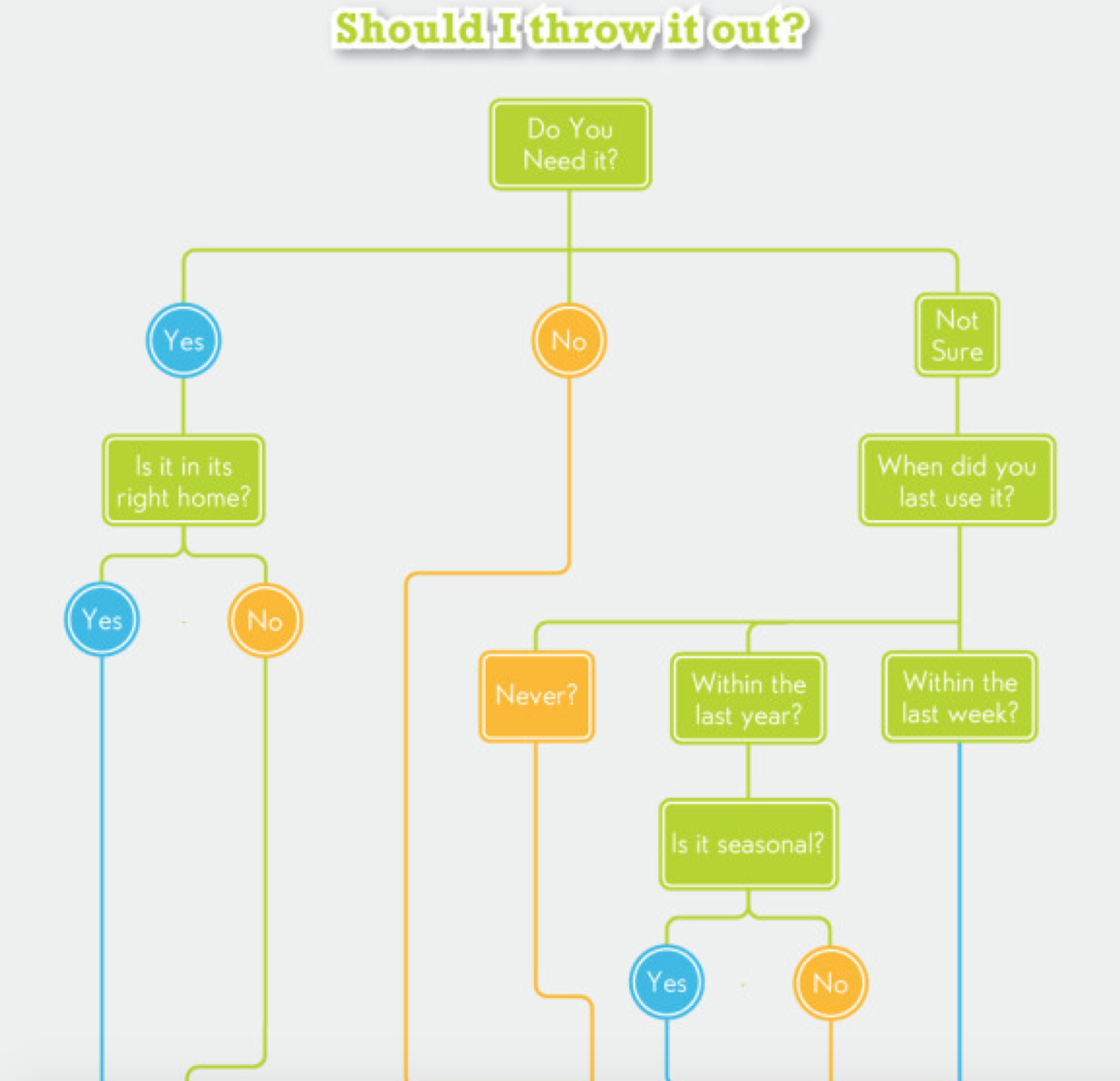
How does one step move into another? How do you get from the beginning of a concept to the end result? A flowchart is a handy tool to show the connections between different elements of an issue, or to show how they have fluidly come to pass.
People may be wondering what path to take to get to a particular result. A flowchart will give them options, and lay out why each step will have that impact to get them there. It may also help the viewer come to a decision by realizing the impact of each of those choices.
Here’s a good example of a useful flowchart: Your one month guide to beating clutter. I am actually going to use to decide which stuff I don’t need to move to a new apartment.
Try this tool to create an infographic flowchart: Draw.io
Draw.io seems a cool tool to create a flowchart. It could be not as pretty as the one in the example but with a good idea, who cares about the design?
Venn Diagrams
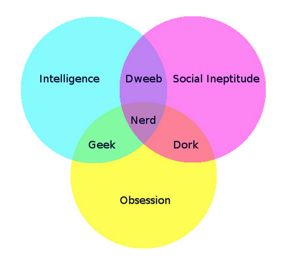
Venn Diagrams are too often seen as overly simplistic graphic tools. People will dismiss them outright because the core design provides few options. You can’t really customize your message with a Venn Diagram, right?
Wrong. These graphics are only limited by your imagination. Some incredible examples have been seen online lately. A personal favorite is this one from Habitat For Humanity. Look at how they have taken all of those side points and combined them with the core message in the center. It beautifully provides all of the information without using the simple design focus that makes Venn Diagrams so special.
Another great example is this one, which actually uses the simplistic reputation to their advantage. It creates a couple of sub-sections to prove a point. Yet, it doesn’t come across as too easy, and is obviously less complex than the last one.
Try this tool to create a venn diagram: Create.ly
Create.ly has a neat and easy tool to create venn diagrams.
Periodic Tables
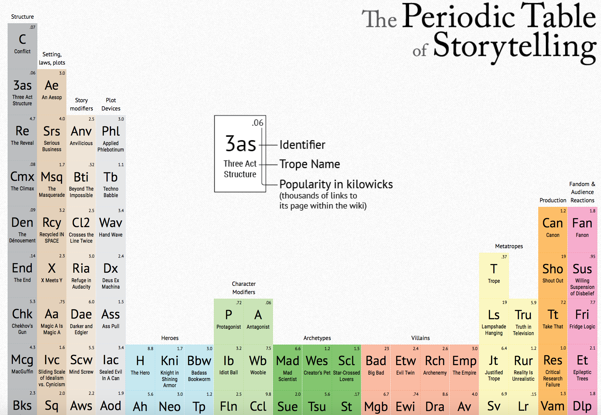
When you think of the Periodic Table, it is almost certainly of Elements. But you can use the same table to deconstruct any concept, breaking it down to its most basic parts. That is what the tool is for: showing what smaller bits make up the whole in a dynamic and immediately recognizable way.
An amazing infographic that used this idea was the Periodic Table Of Storytelling. First, they broke down the types of categories storytelling takes. Next, they listed the different tropes where those categories were illustrated. Next, they took several popular stories that embody those common arcs, and deconstructed them to their “base elements”.
So Avatar: The Last Airbender uses “Empire”, “Anti-Villain”, “Redemption Quest” and so on to tell its story.
There’s no tool with this template that I know of but there are plenty of empty periodic tables online which you modify to include your data (here’s an example).
Visual Maps
Visual maps are some of the more versatile of the infographic types because you can apply to any topic. The map may be a traditional world map with interactive pins showing where certain locations were significant. Or they might be a street map of a city pointing out different relevant businesses to the topic.
Try this tool to create visual maps: Piktochart and Venngage
Piktochart.com and Venngage.com both have infographics templates for map visualization.
Bonus: Getting Creative
This one didn’t make the list, because technically speaking it isn’t an infographic ut I would argue that it follows by the same rules, giving visually intriguing data, even if it is constantly changing.
The Internet in Real Time gives you a look at what is happening on the most important and populated social platforms on the web. So you can see how many accounts and tweets are being created on Twitter, how much is being spent on Amazon, How many posts and comments are on Reddit, and so on.
It illustrates the speed at which data is generated across just a handful of well known sites. But the important distinction that makes this more like an infographic than a website is the embed permission. You can embed this graphic on your website or blog, and get a preview gif.
Have any examples of infographics or tools you want to show off? Leave them in the comments below!


3 Responses
Awesome resource – thanks Ann 🙂
Great post. Misspelled the first word, Inforgraphics,
Fixed! Thanks!
Comments are closed.