You probably already have a plan in place for marketing yourself on Facebook, Twitter, Google+ or all three. But little details really matter in this battle for viewers. One often ignored element is logo optimization.
Thanks to changes to sites in the last year, such as the wide implementation of Timeline on Facebook and the new features on Google+, this is more important than ever. So how do you make sure your logo is properly optimized for social media?
1. Keep Things Nice and Simple
You have to resize your logo for each site. This means different dimensions, and so an overly complex logo will lose some of its effectiveness each time the size is changed. You might not be able to see those finer details or words, and it may actually make the entire thing unrecognizable. Make sure you adapt your logo to be something that will be connected to your original, and remove any unnecessary clutter. The simpler it is, the better.
2. Balance Width and Height
You know that rule of thumb on aspect ratio that you have been ignoring for the sake of creativity and innovation? Yeah, you know…that one about logos not being too wide or tall, but instead being consistent all the way around. You should always make sure your dimensions are equal, and that your logo fits within them. The title of the company should fill the space. This might mean stacking it all on top of one another.
3. Always Use The Same Image
Your logo is supposed to make your company immediately apparent when the viewer sees it. They will connect that image into their mind. Of course, logos adapt over time. But look at Google, or Firefox, or Apple. Sure, their designs have changed, but the central images, colors and recognizable elements have stayed the same. Keep your logo consistent with all of your services, so no matter which social media site it is on, it will be familiar.
4. Keep Images and Text Separate
A logo can look really clever when the images are built into the text. The problem with this on social media sites is once more a dimensions issue. Whether it is on a page, in a sidebar ad or linked from someone else, that image will be resized multiple times. Too small – as will happen from time to time – and it will make it all mesh together. This appears messy and might not be easy to make out.
5. Minimize What You Say
I hate seeing a logo that attempts to explain the point of the company along with naming it. That isn’t what a logo is for. Trying to shove details about what you do or sell, or trying to put pictures in to show it, is a big mistake. It looks unprofessional, and it won’t be viewable in a thumbnail anyway.
6. The Tools and Cheatsheets
How do you know the proper protocol for creating social media friendly pictures? Dimensions and pixel size acceptance is different around the web, and so it can be a bit of a hassle to make sure you are following the rules. Especially for people who use their profiles for professional networking or visibility purposes.
It is even more difficult with Timeline, the newest Facebook format that really shook up the look of profiles. The cover photo, profile image and accepted pictures are all different sizes. How do you keep them apart?
Here are four handy tools and resources for posting social media friendly images.
1. Internet Marketing Ninja Resizer
Once you know the dimensions, you may have to resize your photo. I usually do this in Paint or Photoshop, depending on the level of editing needed. But if you prefer to use an online program, this is a nice and simple online editing resizer. You just select whether you want to upload the image via URL or your computer, choose the file and then upload.
Once you do you just drag the crop box into place and resize it to your specifications, select the file type and hit Done Editing. Then save the image and use it as normal. The only downside is that it does not allow you to resize via entering the pixel or size percentage. For that, you are better using something like Paint.
2. Custom Image SRC
It is really annoying when you are trying to share a link from your WP blog and the link creates its own image that is unrelated to the post. This is a quick plugin that lets you specify what image you want used with each link, so you can sync it up to the correct picture before posting.
Similar tip for Pinterest:
To make Pinterest pick the best image from your page (when people are using “Pin It” button), apply the undocumented nopin attribute to all images that you do NOT want to be pinned, leaving only those that you DO.
This image will be pinned:
<img src=”foo.jpg” />
… while this one won’t:
<img src=”bar.jpg” nopin=”nopin” />
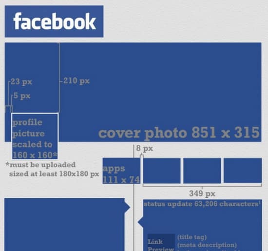
3. Facebook Image Cheatsheet
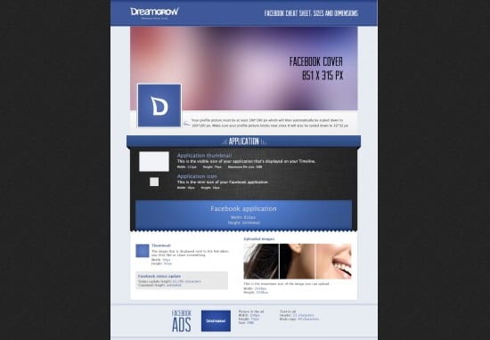
Keep this helpful cheatsheet around to remind you of the correct dimensions for different images around Facebook. It addresses cover photos, application icons, profile images, milestone picture sizes and more. It is the most thorough Facebook cheatsheet I have found so far, so I highly recommend it.
4. Social Media Image Cheatsheet
I am a big fan of this infographic. It covers Facebook, Twitter, Google+ and Pinterest, effectively handling the four biggest social networks. Each one gives you the necessary dimensions for profile images, background images, cover photos and much more. This is a must save guide.
In the end, most images are easy enough to edit if you have the right guide for the right site. Do you know of any helpful tools or resources for making social media friendly images? Let us know in the comments!
Have a tip for optimizing logos for social media? Let us know in the comments.


29 Responses
Leoluca Prestia liked this on Facebook.
Kristopher B. Jones liked this on Facebook.
‘Yusuf Chowdhury liked this on Facebook.
Optimizing Your Logo for #Facebook , #Twitter , Pinterest and #GooglePlus http://t.co/itJ8Fx7I
Doug Fisher liked this on Facebook.
Optimizing Your Logo for Facebook, Twitter, Pinterest and Google Plus http://t.co/HV6Rgi1x #in
Optimizing Your Logo for Facebook, Twitter, Pinterest and Google Plus ~ useful tactical post! http://t.co/dxQ6sMJS
Ranjan Parida liked this on Facebook.
Teresa Beatty liked this on Facebook.
Lilliam Soto liked this on Facebook.
Optimizing Your Logo for Facebook, Twitter, Pinterest and Google Plus @NinjasMarketing http://t.co/Cs7ALXPP
Optimizing Your Logo for Facebook, Twitter, Pinterest and Google Plus @NinjasMarketing http://t.co/cEHsG6sE
Optimizing Your Logo for Facebook, Twitter, Pinterest and Google Plus @NinjasMarketing http://t.co/cEHsG6sE
Optimizing Your Logo for Facebook, Twitter, Pinterest and Google Plus @NinjasMarketing http://t.co/cEHsG6sE
More great #ecommerce advice from @seosmarty: Optimizing Your Logo for Facebook, Twitter, Pinterest and Google Plus http://t.co/cxt8yAdo
More great #ecommerce advice from @seosmarty: Optimizing Your Logo for Facebook, Twitter, Pinterest and Google Plus http://t.co/cxt8yAdo
Handig! Optimizing Your Logo for Facebook, Twitter, Pinterest and Google Plus http://t.co/V2TkHabw via @ninjamarketing
Optimizing Your Logo for Facebook, Twitter, Pinterest and Google Plus http://t.co/98Mtb25w
Optimizing Your Logo for Facebook, Twitter, Pinterest and Google Plus http://t.co/JB5MW3xw
RT @fighto: Optimizing Your Logo for Facebook, Twitter, Pinterest and Google Plus http://t.co/w74m2T63
RT @NinjasMarketing: Ann Smarty’s Post: Optimizing Your Logo for Facebook, Twitter, Pinterest and Google Plus http://t.co/MbwcuYi5
Thats a great article.
All the things you mentioned are most important things about a logo. a logo is a banner of your company.
One more thing, i would love to add ann smarty that you are so beautiful.
Optimizing Your Logo for Facebook, Twitter, Pinterest and Google Plus @alllIMnews – http://ow.ly/eb85c
These are amazing tips. I have no idea that logos play a big part too. I’m not that technical to create my own logo but at least I know what to tell my logo designer. Thanks.
Love your article! Nice tips on how to use logo appropriately. and the facebook image cheatsheet is amazing. Save me ton of time to figure the width and the height of each image. Keep it up
Great Post Ann! You are absolutely correct “Little details really matter in all kind of battle for viewers”. Your post is extremely helpful to people like me who are constantly in touch with Internet and who earns money from Internet Marketing. Advancement in all Social Media sites has really helped me out in promoting my sites and products. I would definitely rank Facebook as the topmost site for marketing.
I love this blog but it came a little too late for me, having spent hours and days trying to be ‘clever’ and designing everything myself. I am going to bookmark this for my next adventure though, cheers
As a graphic designer, THANK YOU for this post! It’s so good that I almost want to send it out to some of our worst offenders. I would say that the MOST IMPORTANT thing anyone with a logo can do, though, is to have a version of the logo that is not… say, 400×200 pixels that we, your agency, were forced to pull from your website. Have something that is high quality with a transparent background. It will keep your poor, long suffering designer from having to use Photoshop’s sad little “sharpen” filter during just about any resize.
Also, the part about balancing width and height? ON. POINT. An off center logo is a square thumbnail’s worst nightmare.
Thats a great article.
All the things you mentioned are most important things about a logo. a logo is a banner of your company.
Comments are closed.